The public preview of Windows 8 has won “rave reviews” according to the Daily Mail, the newspaper that claims to reflect Middle England and is proudly conservative in every sense of the word. The Mail, it’ll have you know, is a feisty opponent of “change for the sake of it”.
So not only do I fear that somebody has spiked the water supply at the Kensington HQ of Associated Newspapers, the Mail’s publisher, I’m puzzled about what it is in Windows 8 that merits a “rave”.
For, apart from an outbreak of violent electromagnetic storms that zap our PCs at random, nothing is going to disrupt ordinary users as much as the design changes Microsoft wants to introduce. So detached from reality has Microsoft become, it touts every one of these disruptions as a virtue.
The problem isn’t Metro, it’s the Maoists
Metro is a user interface designed for smartphones, which I have praised generously, and which looks good and works well on small devices. It may yet mature into something equally attractive and useful on iPad-like tablets. But welded onto a non-touch laptop or desktop PC, it represents a huge negative for the majority of Windows users.
The problem isn’t so much Metro, which by itself represents some good thinking about touch device design. It’s Microsoft’s insistence on inserting Metro between us and what we want to do – and at times Metro is spectacularly inappropriate.
But over at Redmond, the Metro team appears to be completely out of control, like the Red Guard during Mao’s Cultural Revolution. They’ve sent the educated to the countryside to dig trenches, and for good measure broken their spectacles. Nobody seems to be able to say no to the Metro Guard, it seems, for fear of punishment. But welding this immature and inappropriate smallscreen UI into the everyday Windows experience is being carried out in a quite totalitarian fashion.
And this is being welcomed not just at the Daily Mail, of all places, but on blogs and fansites. Apparently, according to WinSuperSite the vanguard of the Red Youth will spend most of its time in Metro while the legacy UI will only be relegated for use by “office workers”.
Hey! That’s us!
I’ll explain a few of the problems here. But first, it must be said, it’s a bit of a crying shame.
Hit me again with your brilliance, Active Desktop
The Windows UI today has considerable room for improvement and simplification, and this can be done without causing such huge disruption to a couple of billion users. The Windows 7 don’t-call-it-a-dock Dock helped non-technical users without causing experienced users too much disruption. Many seasoned Windows users appreciate the Jump Lists, for example, and many who don’t like the feature can happily ignore it. It’s not intrusive.
It’s a shame because the underlying Windows 8 code shows considerable improvement. Windows 8 shows the fruit of several quiet years of throwing out the cruft and refactoring vital portions of the software for performance. Windows 8 boots much faster, applications spring to life, and many common operations just feel more responsive and crunchier – on the same hardware. Windows 8 without the Metro UI might even be the best version of Windows that Microsoft has produced.
So logically, Windows 8 could be released like Apple’s Snow Leopard, a minor $20 upgrade boasting no (or hardly any) new features but performance improvements all round. But of course, Microsoft doesn’t work like that. The accounts team want their margins, the marketing bureaucracy requires something to do. And an industry hangs off this. Consultants smell the prospect of fees, while bloggers hope to cash in with how-to books. Disinterested parties are hard to find.
The problem with Metro in Windows 8 is one of policy rather than execution. At the end of the day Metro is like one of those funky widget layers like Dashboard or Yahoo! Widgets or like a lockdown launcher, like At Ease. But the Maoists have dictated that this ephemeral layer must become the new shell.
You can’t avoid it.
The problems begin with the Metro screen, which is the fullscreen overlay now invoked every time you hit the Windows key, and the mandatory replacement for the old start menu.
This is what Microsoft wants you to see:
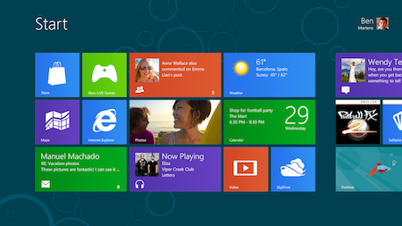
But once you’ve installed a few basic apps, this is what you actually see.
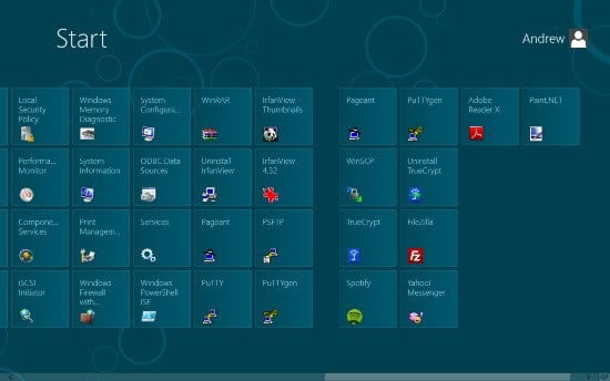
You see your iSCSI Initiator, your ODBC Data Sources and all your uninstallers. Microsoft hasn’t hidden anything or cleaned it up. It’s like when the camera accidentally wanders to the side of the soundstage and you see the backs of all the props.
So do you get anything from this new compulsory widget layer? Well, the quality of Metro apps varies, as you can see. The Maps app is very simple, so simple you can’t drop a pin, in fact. This next screenshot is a Twitter feed in the People app. Bear in mind that Microsoft specifies a minimum optimal screen width of 1366 pixels for Windows 8. And look what you get:
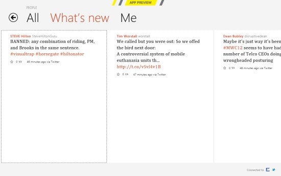
What a great use of space.
In time, no doubt, we’ll get more sophisticated desktop Metro apps – with the extra uncertainty that they won’t run on a Windows Phone, and smaller devices. Ho hum.
Here’s an example of both over-simplification and duplication, two issues which plague this release. Finding common items has become a crapshoot. There are two control panels, this being the simplified, Metro settings panel.
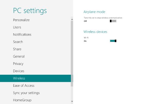
Very nice. Now where’s the Bluetooth toggle? Phones have them. It’s a trick question, because it’s not there.
Things get quite Heisenberg from this point on. Various options float in from the right hand edge of the Metro screen: Search, Share, Devices and Settings; Microsoft calls them “charms”. Click Devices and the only item populating it is “Second Screen”. The Windows 7 devices page has been ripped out of Computer and unhappily relocated in Metro Settings:
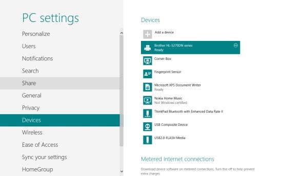
Now you can’t actually do anything with the devices here. Want to check the toner level of that Brother laser printer, or print a test page? Tough. Right click, and nothing happens.
Another strange inconsistency is task-switching. This seems to be something the Red Guard doesn’t want you to do. In last year’s developer preview of Windows 8, it wasn’t possible – you had to swipe through all your applications one by one. Like you do on Windows Phone. With a back button.
Microsoft has restored Alt-Tab, which now works as it has for the past 20 years (it was introduced in v3.1):

But you’re not supposed to use it in this brave new Metro World, you bourgeois recidivist! You’re supposed to use Win-Tab. But look what happens when you do:
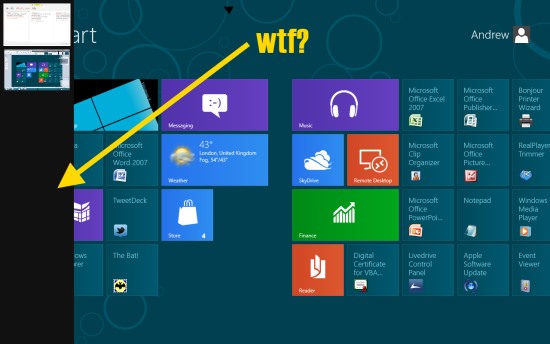
Win-Tab slides open a vertical task bar on the left, with thumbnails of your running apps. Except it doesn’t. Here, Opera and Paint.net and a couple of Explorer windows are running, but not displayed. As task-switching goes it’s useless.
The most persistent annoyance is being thrown back into Metro when you don’t want to be, and while you can change the default handlers for every application Microsoft is going to insist on Metro.
The fix? Make Metro optional
This is just folly. Underneath we have a steadily improving OS, and we have a decent UI layer designed for smaller touch devices. That’s all fine.
I have nothing against Microsoft introducing Metro as an option, as it did with Active Desktop and Windows Widgets.
But inserting Metro into our everyday workflows causes many more context switches (modal switches, in the jargon) than we need. If you’re not on a touch device, there’s lots of pain for very little gain. We are fairly robust creatures who can cope with context switches and UI idiosyncrasies, and the web forces us to do it more often than any UI purist would want (Facebook has its own peculiarities, Twitter and LinkedIn have their own weird design quirks too.)
Microsoft should remember computers are the things getting between us and what we want to do, and making Metro – something so inappropriate for non-touch users – mandatory is completely unnecessary. Time to tame the Metro Guard, I think. ®